 简体中文
简体中文


Having read more SPAC investor decks in the last twelve months than I’d like to admit to, I thought I was over
being irked
by their bullishness. Call me conservative, but public companies shouldn’t be full of shit, and companies going public should probably aim for a similar target.
That’s why S-1 filings for traditional IPOs are great. When it comes to numbers, they are honest. The filings don’t include forecasts for the next year, let alone the next half decade. Sure, companies will make a pitch for their model and methods, but S-1 filings are pretty good from an honesty perspective.
Mostly
.
SPAC investor decks are the opposite. I mean, look at
this chart
:
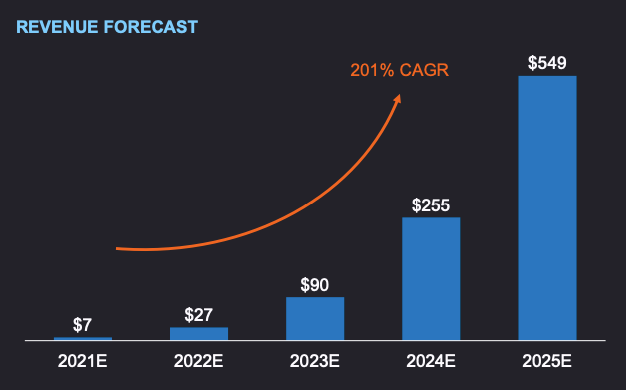
Historical revenue? Who needs it! Look at the growth that could maybe, possibly, theoretically happen! 201% CAGR!
Here’s
another favorite
:
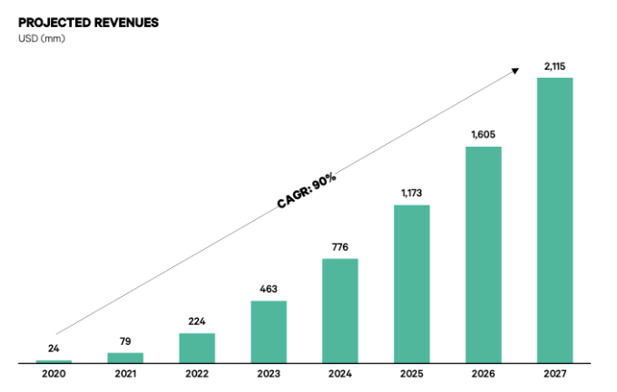
Sure, Bob.
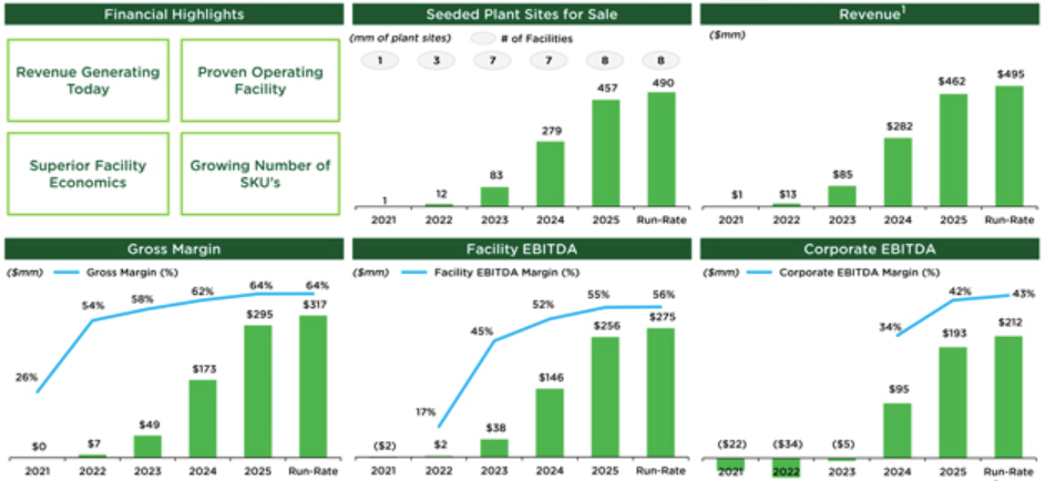
Here’s a super-grainy image from the
Local Bounti SPAC investor deck
. It’s the least-blurry version I could find. Enjoy the charts!
I’m going to change the numbers on these, label them “Alex’s future blogging output” and turn them in before my next performance review.
Here’s another great one,
this time from Pear Therapeutics
:
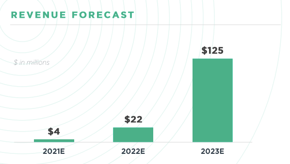
And one more, this time from the
recent Embark deal
that TechCrunch covered here
:
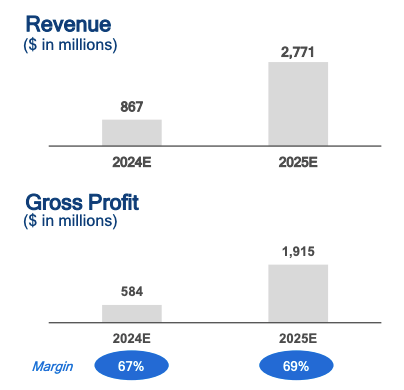
What about historical revenues? Or expectations from 2021, 2022 or 2023? Who knows!
Given
what we’ve learned about the accuracy of SPAC performance predictions
, I think we need a Godzilla-sized Salt Bae to make all of this palatable.