 简体中文
简体中文

Colors are like words, they have meaning. They can represent emotion, such as yellow for optimism. Traffic lights, of course, with green for go and red for stop, are the most obvious everyday examples.
People use color in their daily lives for a myriad reasons and in their homes to show their personality and to relax.
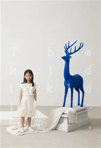
Picking a color of the year helps reflect the global temperament. In the West this is the award season for the entertainment sector with the Grammys and Oscars. And for 2020 the award goes to-two leading companies in the field, Pantone and PPG, nominated the same hue-deep blue.
The Pantone Color Institute started to forecast color trends two decades ago, and this year, the classic blue was selected as the star color by its team of experts from all over the world. They drew inspiration from film and television, art collections and fashion shows.
PPG, specializing in paint and coatings, announced its first color forecast in 2014. It chose Chinese Porcelain blue for this year-the same as classic blue to the naked eye.
The color was selected by 20-odd global color stylists from various sectors, including the automotive, consumer electronics, aerospace and home paints and stains. Over the previous year they researched, studied and analyzed lifestyles, demographics, global and cross-cultural societal inspirations, according to Dee Schlotter, PPG's senior color marketing manager.
The rise of blue reflects consumer desire for relaxation, reliability and adventure, says a PPG report, and blue is set to stay, being a popular choice for automobiles over the next four years.
Pantone describes classic blue as a restful color, which brings a sense of peace and tranquility to the human spirit, offering refuge, on its official website. PPG adds that the choice of blue reflects people's demand for trust and calm. It sees Chinese Porcelain as a blend of cobalt and moody ink blue that imparts calmness, hopefulness and restful sleep-precious commodities in a restless world.
The need for simplicity and escapism from technology is, in part, the reason that consumers are craving blues that bring us closer to natural elements such as the sea and sky-elements that represent peace and serenity, Schlotter says.